Since color can provoke meaning in media texts, I've decided to include certain colors to give my film more meaning. Often times there are monochromatic, analogous, complementary, triadic, and split-complementary color palettes. These all can convey different meanings depending on the colors that they use.
:max_bytes(150000):strip_icc()/easy-color-schemes-from-color-wheel-797784_V4-51db985b605c49e29ee1f6186d6ec258.png)
Monochromatic is one hue of color, with variations in lightness and saturation. This can create depth and focus for the media text.
Analogous has neighboring hues of color. It combines colors next to each other on the color wheel. For example, greens and blues. This creates harmony and less contrast in a media text.
Complementary are opposite hues of color. It creates high contrast and visual pop or attractiveness.
Triadic is evenly spaced hues of color. There are three colors that are evenly spaced on the color wheel which offers vibrancy.
Split-complementary is one hue of color along with the neighbors of its opposites. This softens the impact of complementary color schemes since it uses a base color and two colors adjacent to its complement.
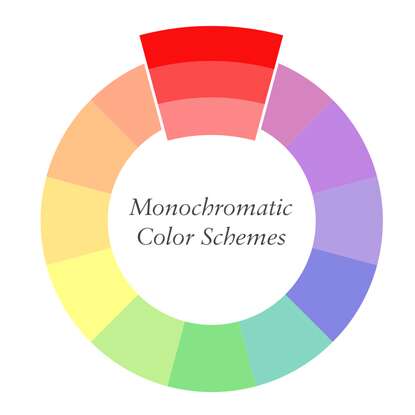
All of these convey different meanings, but I want to create a really in-depth short film in terms of color. So, I will be using monochromatic. I believe that the monochromatic color scheme will provide my audiences with a sense of support and understanding because the whole film would be more impactful if I only used one color at a time.


No comments:
Post a Comment